The goal of this blog is to explain what is a Pareto Chart, why is it useful, how it’s used and to give you 20 amazing facts about the Pareto Chart that you can’t miss.
According to Wikipedia, a Pareto Chart is a type of chart that contains both bars and a line graph, where individual values are represented in descending order by bars, and the collective total is represented by the line.
Pareto Chart is a graph that indicates the frequency of defects, as well as their impact.
 Book Free Strategy Call
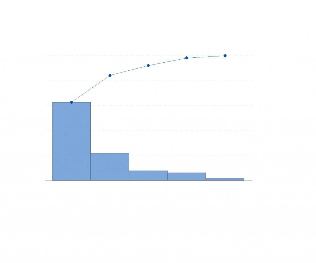
You can also refer the Pareto Chart as Pareto Analysis or Pareto Diagram, these are the common names for the Pareto Chart.
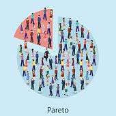
As far as the history of Pareto Chart is concerned, it was developed in 1897 by Vilfred Pareto, a 19th century economist and sociologist. The Pareto Chart came into existence for the purpose to represent the uneven distribution of wealth.
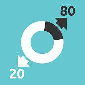
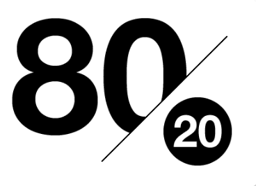
Vilfred Pareto believed that 80% of the wealth was controlled by 20% of the population. The Pareto Principle we know today comes from this idea of the 80-20 rule. which attributes 80% of problems to be caused by 20% of factors.
Pareto Chart can be generated by simple spreadsheet programs or by using online quality charts generators. The Pareto Chart is one of the seven tools of quality control.
Do you know what the seven basic tools of quality control are?
As a six sigma, Pareto is used for measuring and evaluating the quality of the product on the factory floor that is vital to each and every manufacturer. Quality experts for years have trusted 7 tools to define the quality of the product, most popular of those tools is Pareto Chart.
- Cause-and-effect diagram
- Check sheet
- Control sheet
- Histogram
- Pareto Chart
- Scatter diagram
- Stratification
A Pareto chart is designed to separate the significant aspects of a problem from the trivial ones. By graphically separating the aspects of a problem, you can know where to direct its improvement efforts.
With the help of the chart, causes of most of the problems can become easy to identify.
What Questions the Pareto Chart Answers
- Largest issues facing your team or business?
- What 20 percent of sources are causing 80 percent of the trouble?
- Where should our efforts should be to achieve the greatest improvements?
# How can you construct a Pareto Chart?
A pareto graph can be developed by dividing the range of the data into segments.
The horizontal axis of the pareto chart is labelled with the group names of your response variables and the left-side vertical axis of the chart is for Frequency, the right-side vertical axis of the pareto chart is the cumulative percentage.
You at that point decide the quantity of information focuses that live inside each gathering and develop the pareto graph, yet not at all like the bar outline, the pareto diagram is requested in sliding recurrence extent.
# What is a Pareto Chart Used For?
Pareto Chart is used as a quality control tool to visually illustrate the most important factors of a particular problem.
The purpose of Pareto Charts is to distinguish the significant aspects of a problem from the trivial ones.
You can use the chart to analyze the causes of downtime on the factory floor and determine a solution to fix the problems.
# When to use a Pareto Chart?
You can use the Pareto Chart analysis to find a pattern that can generate greatest impact or to employ the most significant resources and activities.
If you wish to use a Pareto diagram, then your process data needs to follow the following two criteria:
- The data has to be arrangeable into categories
- The ranking of the categories should be taken into consideration.
Check Out Our Other Courses
- Six Sigma Green Belt Certification
- Six Sigma Black Belt Certification
- Six Sigma Master Black Belt Certification
Henry Harvin also provides these courses
Henry Harvin Provides Six Sigma Course in these Cities:
Delhi, Noida, Gurgaon, Chennai, Hyderabad, Kolkata, Patna, Pune, Chandigarh, Lucknow, Online
Media Coverage
Henry Harvin Ranks #1 Six Sigma Certification Course Amongst Top 5 by Business Standard, India Today, The Tribune, Prime Insights
# Pareto Principle
Pareto Principle or the 80/20 rule says that 80% of the wealth was controlled by 20% of the population.
In general, the Pareto Principle is the observation that most things in life are not distributed evenly, some contribute more than the other.
Which means 20% of input gives 80% of result. There is a misconception that the numbers 20 and 80 must add to 100 — they don’t!
Even 20% of the workers could create 10% of the result or 50% or 90%.
The Pareto Principle is actually an observation, and not a law of nature.
# Pareto Analysis
It is just another name for Pareto Chart, the Pareto Analysis helps in identifying common causes for persisting issues.
Pareto Analysis identifies key causes of problems, it also organizes a plan of action and helps in improving productivity and profitability.
It is a statistical method of working in decision-making which you can use for selecting a limited number of tasks that produce remarkable overall effect.
Pareto analysis can be termed as one of the most powerful problem-solving tools, which can help you with making subdivisions, multi-perspective analyses, and repeat analyses.
There are two ways to analyze Pareto data depending on what you want to find:
#1 Counts Pareto
This type of Pareto analysis is used to learn which category occurs most often, you can find that by doing counts Pareto diagram. For creating a counts Pareto, you will need to understand the categories and how often each occurred.
#2 Cost Pareto
This type of Pareto Analysis is done to know which category of problem is the most expensive in terms of cost, it provides more information about the about the impact of a specific category.
To further illustrate, the Pareto chart is designed to be the visual representation of the few against many. With the help of the chart, you can easily identify the causes of most of the problems.
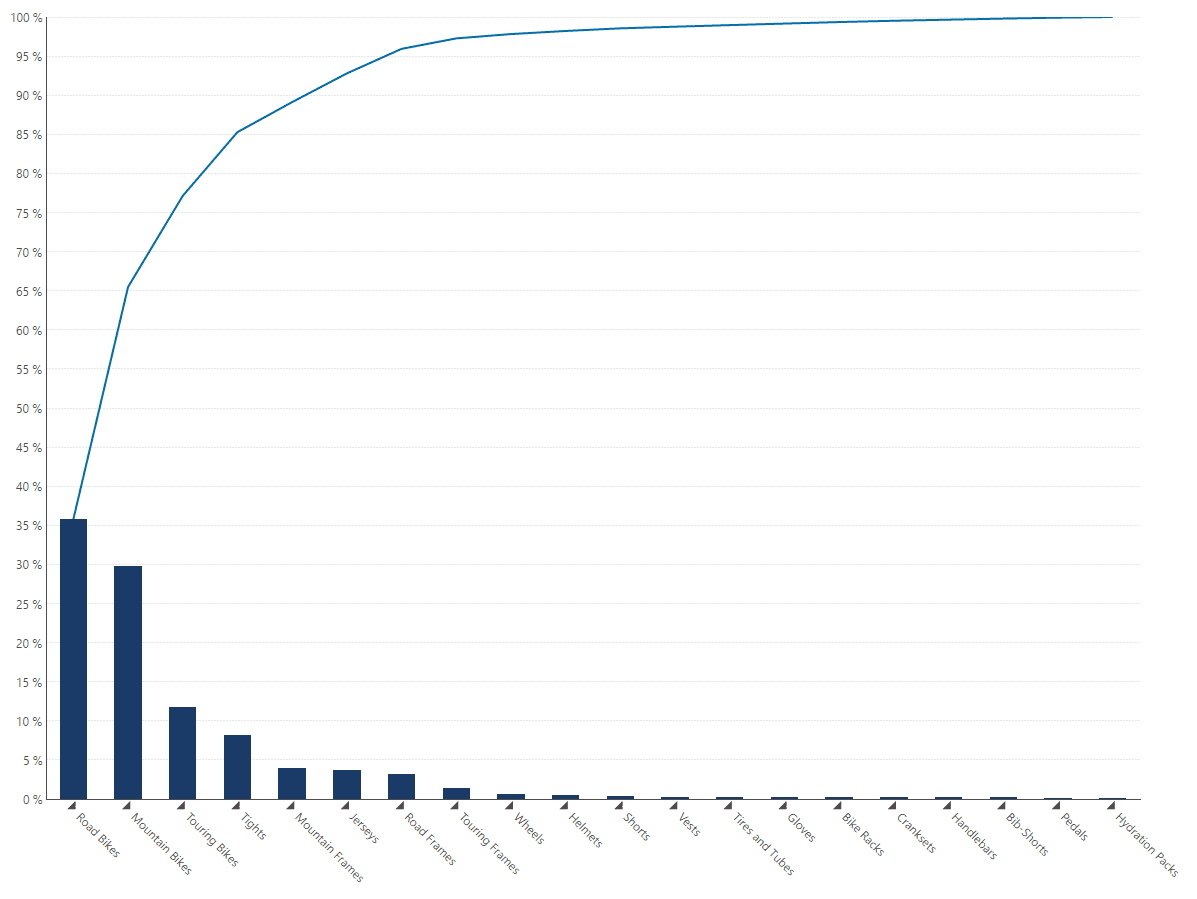
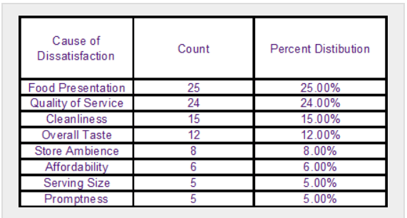
Below are some Pareto Chart examples that you should have a look at:
Let’s take the restaurant setting as an example to illustrate the Pareto principle. We will ground our study to the data gathered from customers’ comments on the survey sheets given to them. We will use the information below:
The survey yielded 100 counts of dissatisfied customers and their reason for the dissatisfaction, by ranking the failure from highest to lowest.
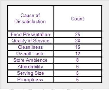
After computing the percent distribution of each failure by dividing the count of each failure by the total number of failures, then multiplying by a factor of 100.
Now you will have to compute the cumulative contributions of the failures in order of their rank.
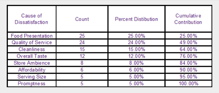
Now you can finally create your Pareto Chart. Highlight the failures, count and cumulative contribution.
Some essential components of a Pareto Chart
To construct a Pareto Chart, you need to understand its components. The relationship between the components is also important to understand.
Since the Pareto Chart contains both bar and a line graph, where the bars are in descending order while the line represents the cumulative total.
Being a bar graph, the Pareto Chart is made of two main variables which form the x-axis and y-axis.
The Y-axis of the Pareto Chart represents the frequency of occurrences while the X-axis shows the categories being measured.
You can summarize the components of Pareto Chart as:
- x-axis– categories of data
- y-axis– the number of occurrences
- ranked bars – the bars are placed in descending order and aligned with the frequency of the event
- cumulative percentage curve– on the y-axis the cumulative percentage is shown while traversing the categories from left to right.
Read About: Six Sigma Green Belt Course In Delhi
# What is the building process of Pareto Charts?
A step-by-step procedure for beginners:
To illustrate the components and proceeding of building of a pareto diagram, we shall use the paradigm of a fictional business setting. For instance you want to find the occurrence of specific obstruction in your business process. You need to follow these simple steps to build a Pareto Chart.
Step 1: Determine the category you will use to sort and group the obstructions.in our case, the categories will be groups of different obstructions in the workflow process. Let’s say they are named as P,Q,R and S.
Step 2: Consider which measurement is the most appropriate for grouping the determined categories. As for example, the measurement for the various groups of obstruction can be the magnitude of occurrences of the specific obstruction.

Step 3: Put on your working hat and come up with a specific chronology which the Pareto Chart will cover. This can be an interval of time like one work cycle, a full day, a sprint, seven days, a month etc
Step 4: After the first three steps of the procedures are finished, you have to record, manage organize or sort the data in a table with reference to the above mentioned steps. The table you will create shall have two columns that are: obstructions and the number of times of occurrence of obstructions also known as frequency.
Read About: Six Sigma Green Belt Course in Noida
20 Amazing facts about Pareto Chart
- Did you know? Pareto Chart is a combination of both bars and a line graph!
- Pareto Charts can be analyzed with the Pareto Principle.
- The Pareto Chart is also known as Pareto Analysis or Pareto Diagram.
- In Pareto Principle there’s a common misunderstanding that the numbers 20 and 80 must add to 100 — but they don’t!
- Pareto chart analysis visually displays the data and hence makes it easier to judge whether the Pareto Principle can be applied to the data or not.
- It is one of the most powerful of the problem-solving tools for system improvement.
- Did you know, Pareto Chart is used as a tool within the Six Sigma framework, a mathematical method for tracking company performance.
- The name of principle is derived from the Italian economist Vilfredo Pareto, however, the Pareto Chart is derived from the Pareto principle, which was suggested by a Romanian-born American management consultant, Joseph Juran during WWII.
- The graph actually indicates the frequency of defects, as well as their cumulative impact.
- The Pareto Chart is useful to find the defects to prioritize in order to observe the greatest overall improvement.
- The height of the bar tells about any important unit of measure — often the frequency of incidents or cost.
- The bars are presented in descending order.
- The line represents the cumulative percentage of defects.
- A Pareto Chart is a quality tool and it helps to analyze and prioritize issue resolution.
- This chart is one of the seven basic tools of quality control.
- These charts can even be generated by simple spreadsheet programs.
- The purpose of the Pareto chart is to highlight the most important among a large set of factors.
- Pareto Charts represents the common origin of defects, the highest occurring type of defect or the most frequent rationality for customer complaints and so on.
- We can actually apply the 80/20 rule to almost anything: 80% of delays in the plan result from 20% of the possible causes of the delays. Also, we can say, 20% input gives 80% of the result.
- This chart is used to arrange data into categories and to see if each category is important.
Challenges of a Pareto Chart
With some large data sets, however, there may be a large number of categories, which will make the display of these root causes or categories in a chart form difficult.
A Pareto chart format is not always workable. For example, a company’s service desk may create incident token for every incident and call that comes in.
For each of these token, the fix agents will categorize them using a category, sub-category and even a further breakdown of the sub-category. If they will perform a Pareto analysis of all the gathered categorizations of incidents, they could have several hundred groupings.
Then the Pareto chart of this data would not fit in one page.
Read About: Six Sigma Green Belt Course in Gurgaon
Conclusion
Pareto Chart may not be the best strategy for every case. The main principle of this chart is to tell us that most things in life are not evenly distributed.
The 80/20 rule may not make sense but the actual point is to realize you have the option to focus on the important 20%. In the blog we also came to know about how Pareto Chart is used as a quality control tool to visually illustrate the most important factors of a particular problem.
We talked about Pareto Principles and Pareto Analysis and also what are the essential components for creating Pareto Chart.
You have also read above the step-by-step procedure for building Pareto Chart. You got to know 20 amazing facts about this chart through this blog.
Did you find this blog useful and practical? Are you now aware that What is a pareto chart? Is Pareto analysis a tool you have already applied to your business?
Let us know if you practiced building Pareto diagrams using our tips or if you learned something new today. And if you liked the blog or if we missed anything, please leave your precious feedback in the comment section below!
Recommended Reads:
- Best Six Sigma Course in India
- Best Six Sigma Courses in Bangalore
- Best Six Sigma Black Belt Courses in Delhi
- Best Six Sigma Courses in Chennai
FAQ’S
Pareto Chart contains both bars and a line graph, where individual values are represented in descending order by bars, and the progressive total data is represented by the line.
Also known as Pareto Analysis or Pareto diagram, it is a graph that indicates the frequency of defects, as well as their impact.
The Pareto Chart is one of the seven tools of quality control.
It is used to separate the significant aspects of a problem from the trivial ones. By graphically separating the aspects of a problem, you can know where to direct its improvement efforts.
It is used to solve issues that face business or team. It talks about what efforts should be made to achieve the greatest improvements.
Step 1: Determine the category.
Step 2: Decide which measurement is the most appropriate for grouping
Step 3: Make up your mind an come up with a specific chronology which the Pareto Chart will cover.
Step 4: You have to record, manage organize or sort the data in a table.
Pareto Principle isn’t just used to make problem solving decisions. They are also used to set priorities for many practical applications.
You can use the Pareto Chart analysis to find a pattern that can generate greatest impact or to employ the most significant resources and activities
A Pareto Diagram has several key benefits…
1. Pareto chart is easy to draw
2. It helps your team focus on the inputs that will have the greatest impact on your business.
3. The Pareto Chart helps visualize problems quickly, hence it is an excellent visual communication tool as well.
Pareto Principle or the 80/20 rule says that 80% of the wealth was controlled by 20% of the population.
In general, this Principle is the observation that most things in life are not evenly distributed, some contribute more than the other.
Which means 20% of input gives 80% of result.
Pareto Chart originated in 1897 an Italian economist Vilfredo Pareto. It was then used to represent the distribution of national income. Later, it helped as a quality control tool to analyze problems and sum up the impact of factors, so it was called Plato.
The Pareto Analysis helps in identifying common causes for persisting issues.
Pareto Analysis identifies key causes of problems, it also organizes a plan of action and helps in improving productivity and profitability.
It is a statistical method of working in decision-making which you can use for selecting a limited number of tasks that produce remarkable overall effect.
Pareto analysis can be termed as one of the most powerful problem-solving tools, which can help you with making subdivisions, multi-perspective analyses, and repeat analyses.
E&ICT IIT Guwahati Best Six Sigma Green Belt Program
Ranks Amongst Top #5 Upskilling Courses of all time in 2021 by India Today
View Course